For this concept I wanted to make it serious which fits for a more corporate aesthetic. The simple letter A surrounded by fig leaves. From there I managed to conceive one of the main design elements for this project which is the slanted lines almost like the sides of the letter A.
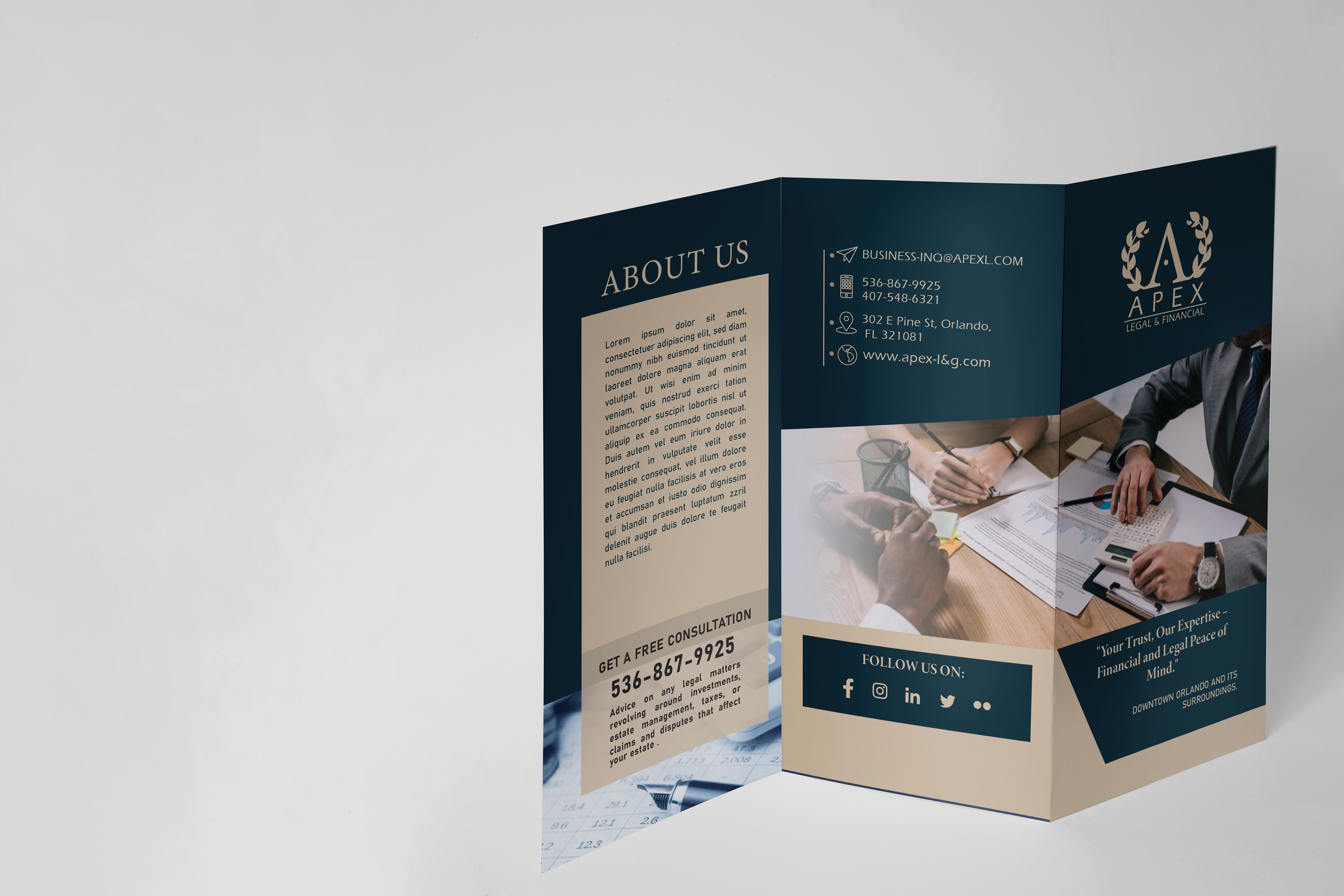
Brochue
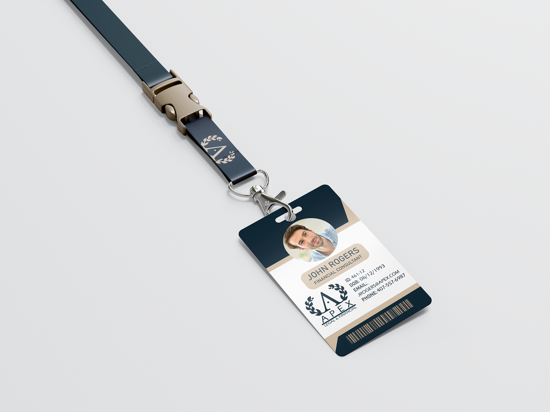
Lanyard
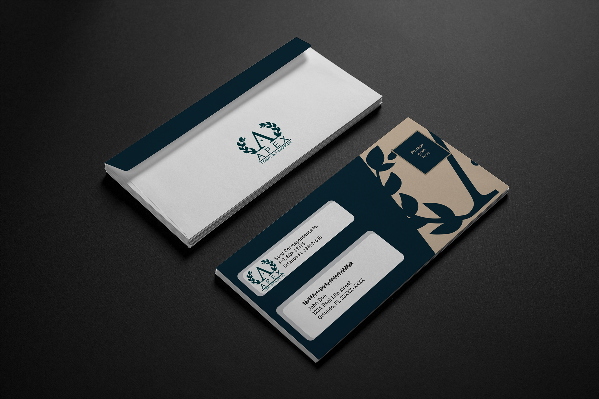
Envelope
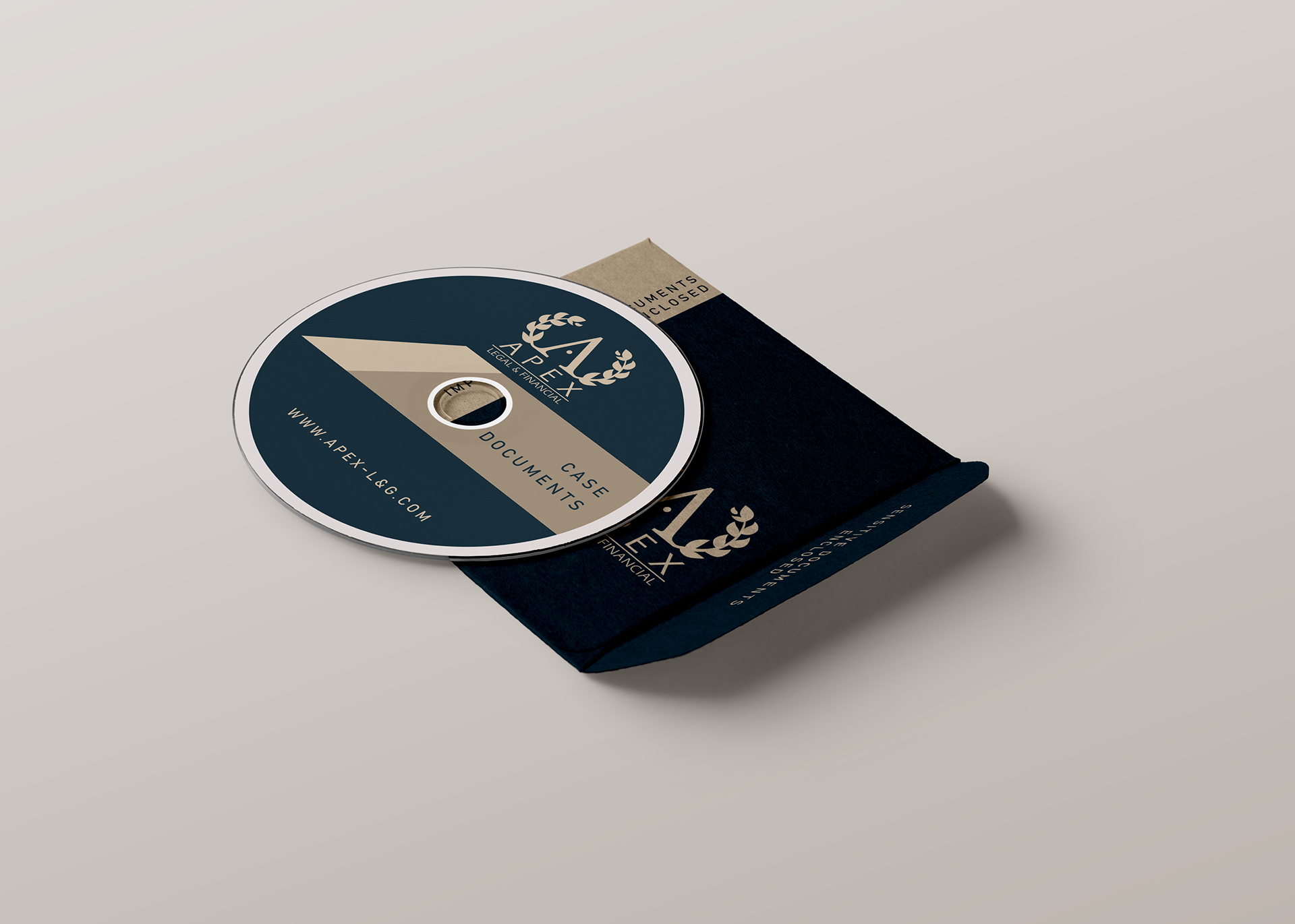
CD and Case
As you can see the color palette revolves on the same 3 colors with very little change, with a lot of solid shapes who tend to be fully straight or slanted to add to the aesthetic.
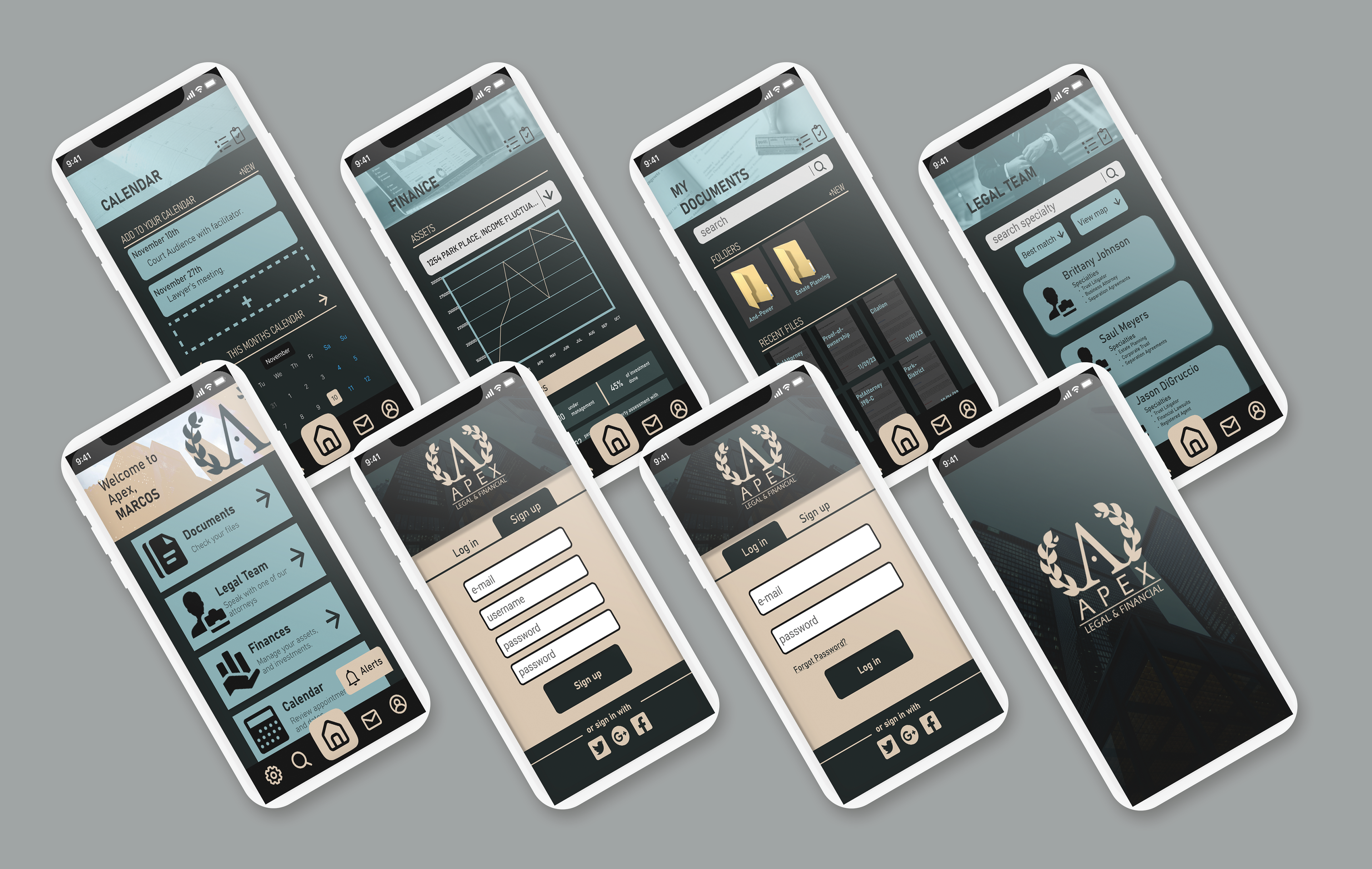
A website and mobile app was devised as well for the company. The main design was simple and following the design guidelines that are already in place. And I keep it serious and simple to understand for the customers who are interested in services.
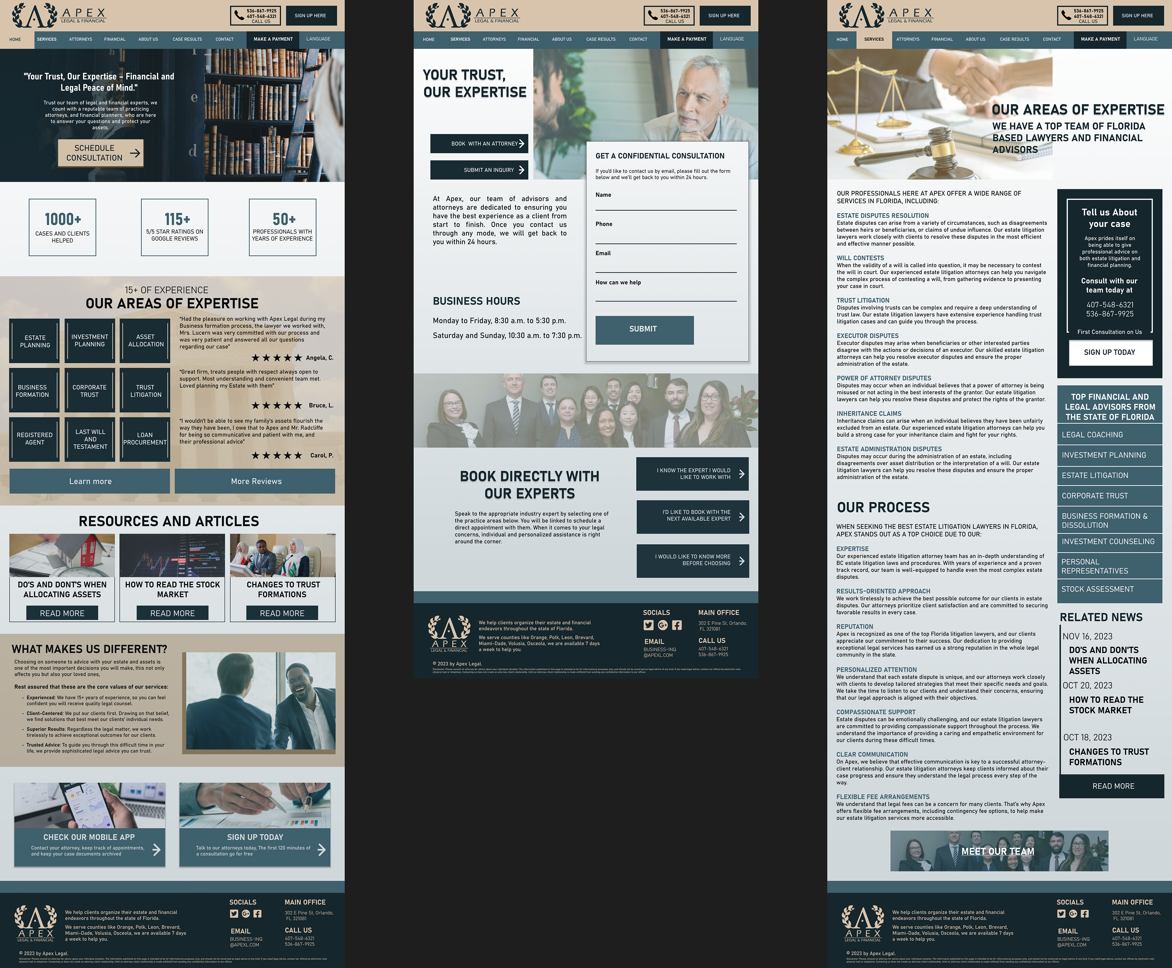
Full Website pages
